In my previous post, I showed how to make a 3D view of an area using the
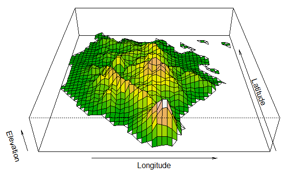
persp function. However, I felt this was not a complete representation, especially for digital elevation. While looking for some reference for my presentation on the use of R for data analysis and visualization, I came across a thread discussing " 3d plot with different levels done in different colors (solution)". In this thread, a co-blogger
Tamas K Papp's shared his levelpersp function. Using this function I tried to plot 3D view of
Marinduque, Philippines using terrain and topo color.
 |
| 3D persp using terrain color |
 |
| 3D persp using topo color |


It would be great if you could link to the thread you found, and provide more explanation about what you did to generate these plots.
ReplyDeleteHi Brandon,
DeletePlease find below:
https://stat.ethz.ch/pipermail/r-help/2003-July/036151.html
sorry but what is the use of a plot without its code and data, is R a drawing competition
ReplyDeleteThis comment has been removed by the author.
ReplyDeleteHi Arnold! I really liked your plot and trying to do the same for an elevation map of Morocco.
ReplyDeleteI am using the following code to get a persp plot ok:
alt <- getData("alt", country="MAR")
adm <- getData("GADM", country="MAR", level=1)
#mar<-(adm[adm$NAME_1==”Marinduque”,])
maralt<-crop(alt,adm)
persp(maralt, exp=0.2,phi=35, xlab="Longitude", ylab="Latitude", zlab="Elevation")
But I can not figure out how to translate this to use the levelpersp function. How do I assign the x, y & z values?
Maybe you could share how you did that?
GREAT
ReplyDeleteA Colored 3D Map is a visual representation of geographic or spatial data using three-dimensional shapes, colors, heights, and locations to make information easier to understand. Different colors can represent different categories or values, while the height or size of objects can show quantities such as population, sales, rainfall, or elevation.Data Analytics Training. For example, a 3D map can use taller buildings or darker colors to represent areas with higher population. Colored 3D maps are commonly used in geography, data visualization, urban planning, business analysis, and scientific research to identify patterns and compare information more clearly.
ReplyDelete