This was a revised version of my previous post about the NSCB article. With the suggestion from Tal Galili, below were the new pie charts and the R codes to produce these plots by directly scrapping the data from the webpage using XML and RColorBrewer pagkage.
Unemployment by Age Group
Unemployment by Gender
Unemployment by Civil Status
Unemployment by Educational Level
Friday, October 26, 2012
Thursday, October 25, 2012
NSCB Sexy Statistics (Unemployment)
Recently, my friend posted on her Facebook account about the article published by the National Statistical Coordination Board (NSCB) about poverty and unemployment in the country. Looking at the report I saw a lot of tables, so I thought why not use R to make some graphs out of these tables (with some inspiration from the mazmascience).
Percent Unemployed Per Age Group
Percent Unemployed by Sex Group
Wednesday, August 8, 2012
Rainfall Amount Flooding Quezon City Philippines
August 6-7 Rainfall on Metro Manila
Majority of Metro Manila is affected by floods. Looking at the hourly data from PAGASA weather station located at Bicutan, Taguig, the graph below will gave the viewers of this blog on the rainfall situation in Manila from August 6 (12:00am)-7(11:15 pm), 2012.
Tuesday, August 7, 2012
Provincial Monthly Rainfall of the Philippines from WORLDCLIM
Preparing for a future conference on climate change, I downloaded and extracted average monthly rainfall in the Philippines from worldclim.org. Using maptools, raster, and animation package in R, I produced an animation of average monthly rainfall of the country.
Monday, August 6, 2012
Provincial Map using GADM
Monday, July 9, 2012
Trend and Spatial Pattern of Poverty in the Philippines
In a teaching demo that I have conducted, I discussed on how R can be
used to analyze trends and spatial pattern of poverty incidence in the
Philippines. Playing on the data I got from the National Statistical Coordination Board below is what I got.
Scatter Plot Matrix
Histogram
Poverty Incidence Map
Spatial Pattern
Sunday, July 1, 2012
Colored 3D Map
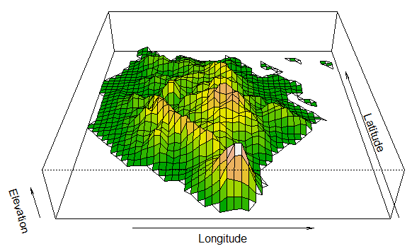
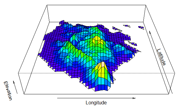
In my previous post, I showed how to make a 3D view of an area using the persp function. However, I felt this was not a complete representation, especially for digital elevation. While looking for some reference for my presentation on the use of R for data analysis and visualization, I came across a thread discussing " 3d plot with different levels done in different colors (solution)". In this thread, a co-blogger Tamas K Papp's shared his levelpersp function. Using this function I tried to plot 3D view of Marinduque, Philippines using terrain and topo color.
 |
| 3D persp using terrain color |
 |
| 3D persp using topo color |
Sunday, June 17, 2012
Negros Quake Animation in R
Taken from a previous post in other website, maps below show the locations of epicenters and sequence of earthquakes that struck
Negros last February 6, 2012. The bottom image is the animation these maps using animation package in R. Data was taken from United State Geological Survey.
Subscribe to:
Comments (Atom)


